Open Food Facts turns 10 !
2022 is particularly special for us, because Open Food Facts is turning 10!
In 10 years and a few feats later:
🌍 Open Food Facts is now in 182 countries,
🍫 with 2.3 million food products on the database,
🤳 + 2.9 million scans via our mobile app in 2021,
👀 + 2.7 M monthly visitors on our website, and not to mention…
🙌 over 20,000 contributors without whom all this would have been impossible!
So to celebrate these collective achievements, Open Food Facts has undergone some ch-ch-ch-ch-changes (in the words of Bowie).
To take us into the next chapter of the Open Food Facts adventure, we are putting on a brand new visual identity, more accessible, in tune with the times and easily identifiable.
Our barcode logo has served us well, but time has come for it to retire peacefully.
The new logo is the collective fruit (no pun intended) of the graphic designer Quentin Lagrange, our team and the involvement of our community (via a questionnaire). When we took into account your feedback concerning the first creative directions presented by Quentin, it became clear that they were a bit too “techy” and lacked to represent the human and food-centered adventure that is Open Food Facts. That is why we asked Quentin to bring in more emotion, add the Food aspect, and above all, save the magnifying glass that represents so well the action of ‘deciphering’ (our raison d’être). And so was born the zestful Orange 🍊!
As to the choice of the colour orange, it symbolises energy, enthusiasm, warmth: all qualities that describe so well our community of committed contributors. The orange tree is often associated in literature with generosity. And, like the collective, the whole (fruit) is composed of several parts.
You may also spot the ‘label’ (with the word FOOD) because at Open Food Facts we just can’t get enough of them 😉 !
The font Plus Jakarta Sans was picked for its potential to stand the test of time and for its warm, rounded feel.
The other big plus of this new logo is its ability to effectively interchange with several pictograms (ex. Open Beauty Facts) and to appear both horizontally and vertically.
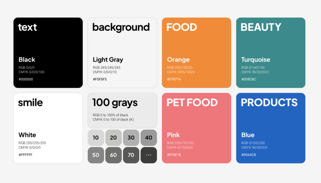
As for the other colours of the visual identity – shades of turquoise, pink and blue – we have continued with the use of vibrant, joyful colours that pop 🤩.
And to efficiently and easily adopt this new look, we have a useful little Brand Guidelines document.
A big thanks to everyone who has taken the time to give us their feedback on the different logo propositions, allowing us to feed the creative process and to result in this new graphic identity ready to shine on the website, app, on to infinity and beyond 🚀 !
✨ Here’s to many new feats together✨ ,
Open Food Facts team : Alex, Charles, Edouard, Gala, Manon, Pierre and Stéphane
No Comments